Websites that Pop
PagerDuty is a leading digital operations management system that envisions a responsive world where everyone has the freedom to thrive. Having already developed a strong brand for them with our ongoing partnership, we were able to concept and build vibrant and informative websites for their 2020 and 2021 Impact Reports.

2020 Report
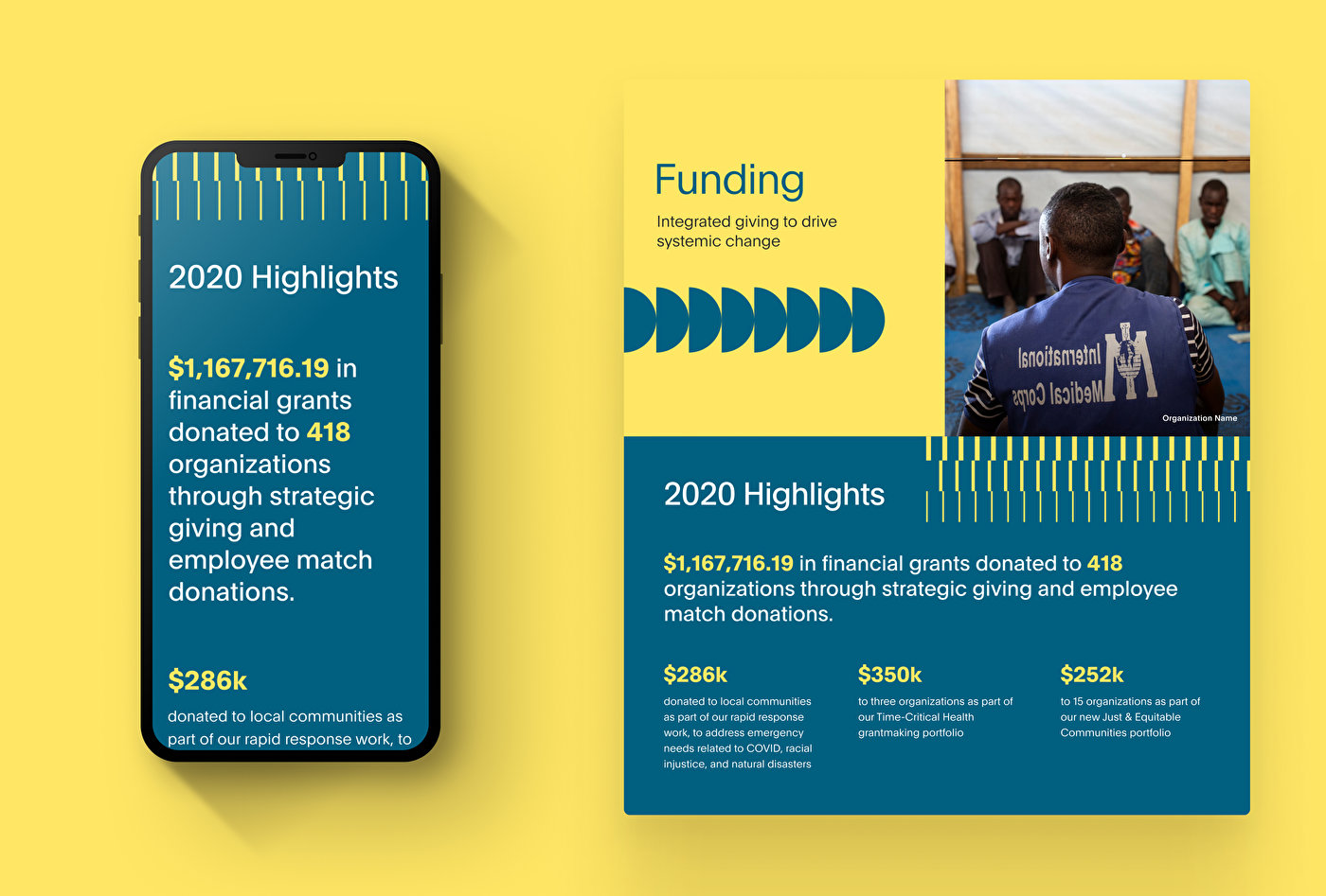
PagerDuty wanted their 2020 Impact Report to reflect the energy and personality of their vision, while also conveying the scale at which they were able to help people that year. We worked with them on a quick-turn project in February and March of 2021. Based on their branding, it was all Owen-designed and built, resulting in a colorful and cohesive representation of their year's accomplishments.


A Creative Framing
The development team was able to quickly develop wireframes that matched the content outline, and provide a blueprint for the design team to work from in visual design. This setup allowed for quick and easy updates for the 2021 site.

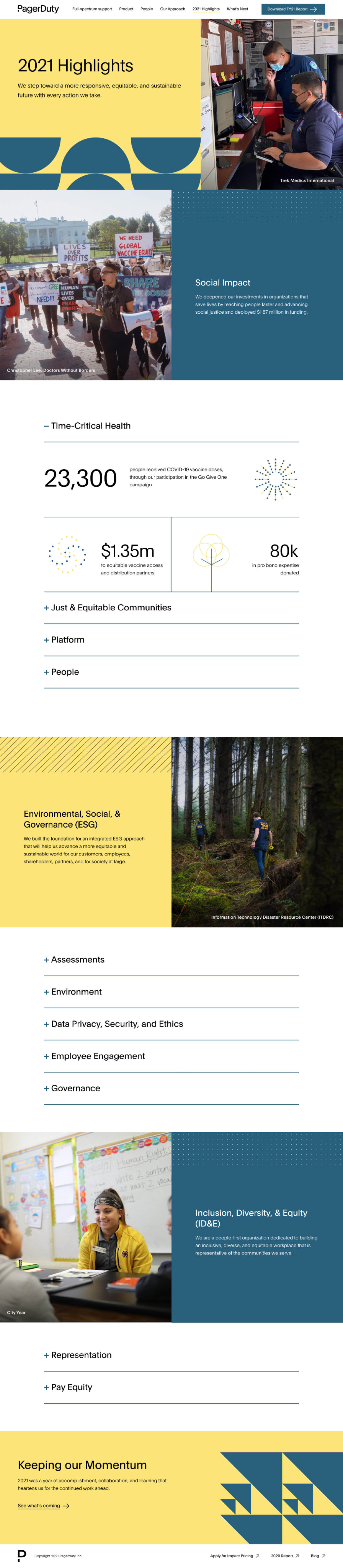
2021 Report
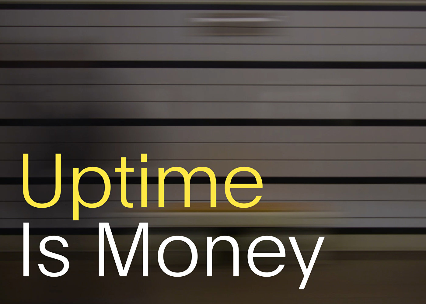
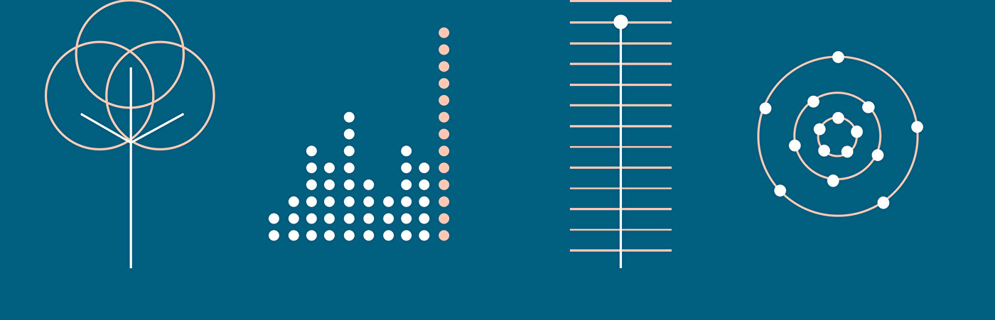
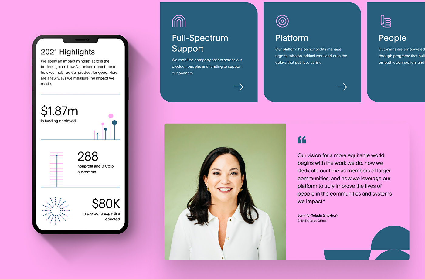
Challenged with creating a site similar to what the client liked last year, but with its own personality, the main stakeholders wanted us to make the 2021 Impact Report feel vibrant, emotive, and to have more “pop.” We worked with PagerDuty’s brand team to find out what was possible per the guidelines, and then added some of our own creativity to push the work — including unique subpages, color palettes, patterns, and icons. With a longer timeline, we were able to build off of last year's model and add more net-new design and information showcasing modules.
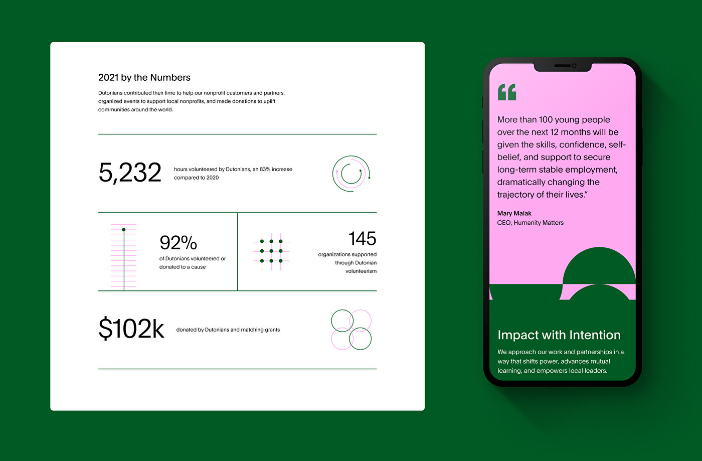

Key Highlights
We used infographic sections to cleanly showcase the stats that PagerDuty wanted to include, primarily on the 2021 Highlights page. An accordion presentation highlighting stats with color and creative icons helped to prevent scroll page fatigue, and maintain visitor engagement.